
Audi was the first German car manufacturer to use a four-wheel drive system with the marketing of the Audi Quattro in 1980. The Audi brand had already existed long before, since 1909.
More than a century later, Audi has still remained a reference in its field and continues to mark the minds of people all over the world. So what is this longevity of the Audi brand worth? How did it transcend time to be accomplished?
Let’s discover through this article the story behind the inspiring visual identity of the Audi logo, its evolution and its meaning.
Source : dubizzle
Audi: the history of the great German automobile brand
Audi, a famous German automobile manufacturer, is known for its premium luxury sedans and rugged off-road vehicles that stand out for their exceptional quality and innovative design.
Audi vehicles have gained worldwide recognition and admiration, with the brand closely associated with a superior driving experience that exudes luxury. The founder’s last name, August Horch, inspired the company’s name.
The German word “Horch”, which translates to “listen” in English, was transformed into the Latin word “Audi” to become the company name. With a history spanning over a century, Audi was founded in 1909 and is headquartered in the Bavarian city of Ingolstadt.
In 1932, four companies joined forces to form Auto Union AG, which later became AUDI AG. The company then needs a new logo. The four interlocking rings were then born.
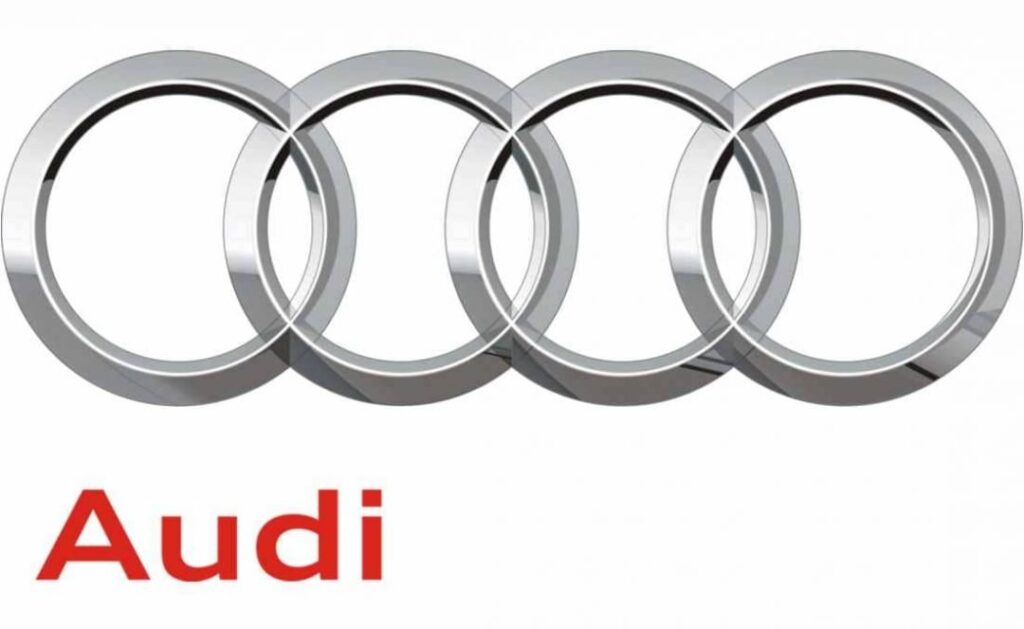
Since then, the Audi logo has consisted of four aligned and superimposed rings. So we have: a white Audi logo and a black Audi logo, depending on the background. This simple, yet iconic emblem represents the automobile brand around the world.
There are three ring thicknesses: Audi Rings Standard, Audi Rings Medium and Audi Rings Light. They are not associated with particular car models. The main thing is that they stand out well and blend into the typography.
Currently, Audi operates as a standalone unit within Volkswagen AG and has production facilities spread across all continents.
Production plants manufacture a diverse range of vehicles, including crossovers, convertibles, mid-range cars, premium cars and commercial cars.
“Vorsprung durch Technik” is the company’s famous slogan, which translates as “Being ahead through technology”.
Understanding the meaning of the Audi emblem
All great signs come with great meanings and hence the Audi logo is one of the most significant automotive logos. Audi’s iconic four circles have a deeper meaning than most of us realize.
The logo of this world-class German automobile manufacturer symbolizes the merger of four companies in the 1930s: Horsch, Audi, Wanderer and DKW, which formed the Auto Union.
Audi’s current logo is a simple design consisting of four interconnected circles. It is sometimes accompanied by the “Audi” wordmark in a clean font. The origins of the brand are quite complex, dating back to the very beginning of the 20th century.
Note that the Audi brand was purchased by Volkswagen in 1960. After relaunching the Audi brand, the Volkswagen company helped create the Audi logo that most people know today.
The Audi logo symbolizes the idea that the brand combines the best possible qualities in a car, including:
- Speed ;
- Maneuverability;
- Ease of control;
- Minimum fuel consumption;
- Etc.
A century after its creation, the Audi logo has evolved.
The Audi logo has been refined over the years. The main cause of these developments can be attributed to the change in ownership of the company and its position in the market.
The four-ring emblem appeared more than 20 years after the brand’s launch. Let’s review the years from its conception to the current version of the logo.

Source: logos-world
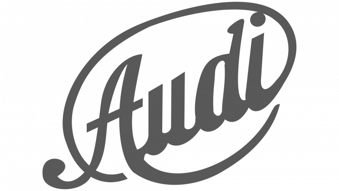
The 1909 Audi logo
Source: logos-world
The Audi logo designed for the company’s pre-launch has nothing to do with the one we know today. Rather, it is a cursive wordmark slanted upward in an oval outline. The logo was made in dark gray, which gave it a professional and strict look.
The 1909 – 1910 Audi logo

Source : 1000logos
In 1909, a radically new solution was developed. Changes were made to the logo before the company was officially established in 1909.
The new Audi logo looks like a number 1 placed above a semi-circle and an upside-down triangle. The word “Audi” always appears in italics. It is designed with the combination of strict black and white colors.
The design incorporates various symbolic elements. The company name is written in white in the black triangle.
The founder of the company wanted to express through this logo that Audi cars are at the forefront of the market.
The 1910 – 1932 Audi logo

Source : 1000logos
Audi’s first logo, when it was created in 1909, clearly drew attention to the brand’s self-proclaimed superiority.
The only difference from the previous version is that the company name is written in a separate font.
The other elements remain the same. On the podium, first place goes to German cars. They combine impeccable quality with an increased level of comfort. This logo remained associated with the automobile manufacturer until 1932, when the Auto Union was created.
The 1932 – 1949 Audi logo

Source : 1000logos
In 1932, Audi went through one of the most significant logo changes we’ve seen in years. The merger of four different brands gave birth to Auto Union and a new logo.
The logo represents the unification of the Audi brand with Horch, DKW and Wanderer: the leftmost ring represents Audi, followed by DKW, then Horch in the third ring, and finally Wanderer in the fourth ring. This new logo, although complex, is very significant.
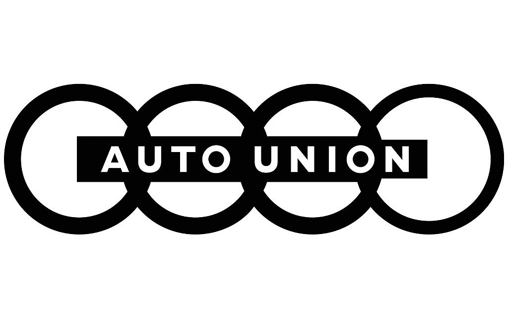
The 1949 – 1969 Audi logo
Source : 1000logos
The complexity of this emblem began to diminish over the years. In 1949, a version of the Audi symbol without the logos of the different entities appeared.
During this period, the logo is composed of a horizontal rectangle, crossing the rings in the middle, on which appears the inscription in capital letters “AUTO UNION”.
The 1969 Audi logo

Source : 1000logos
This year, NSU Motorenwerke AG joined the group, producing motorcycles and cars. The designers are changing the logo again. The four rings linked together disappear.
Instead, a large, simple and strict black rectangular rectangle stretched horizontally, with the white letters of the Audi company on the left side and the capital letter “NSU” in white sans-serif on the right side.
The 1969 – 1995 Audi logo
The Audi company having developed widely since its creation, it has allowed itself to offer itself two different logos during these years.

Source : 1000logos
Volkswagen bought the company in 1965. Subsequently, the factories produced automobiles under the Audi brand in their own right. The Auto Union automobile becomesAudi in 1969, and the rectangular banner was removed from the logo.
The Audi logo is now just four thick blue rings, chained together to represent strength and confidence.

Source : 1000logos
A logotype was also created at the same time: bold white lettering, in a custom sans-serif font, with the rounded shape of the “d”, was placed inside a solid black oval, located at horizontal.

Source : 1000logos
In 1978, the oval became red and was given a double white and red outline, which created better contrast and made the emblem more distinct and brighter. A new chapter thus opens in the evolution of the automobile company.
The new logo of the automobile group is visible from afar. The combination of white and red is traditionally linked to bravery, dynamism and vitality. This is the ideal solution for a business that is growing and striving to achieve new goals.
The 1995 – 2009 Audi logo

Source : 1000logos
In 1995, the designers developed a new version, which was again memorable. They merged the two previous solutions and streamlined the process. The blue rings have been replaced with three-dimensional silver 3D rings.
Below them is the Audi lettering. These letters are a bright red that attracts attention. The designers tried to brilliantly balance the massive wordmark, adding elegance and exclusivity to the whole image. This Audi logo existed until 2009.
The 2009 – 2016 Audi logo
Source : 1000logos
The logo was further refined in 2009, on the occasion of Audi’s 100th anniversary. The chrome color of the Audi emblem now sports an elegant and shiny finish, which gives it a contemporary and refined touch.
The shiny rings are now larger, while the wordmark is softer and smaller, with a more traditional sans-serif font, with shapes slightly elongated and placed in the lower left corner rather than the middle.
The Audi logo from 2016 – present

Source : carlogos
Like many popular brands in 2016, Audi has once again simplified its logo, removing all three-dimensional effects, and the iconic symbol is now executed in simple black, without additional lettering.
The four interlocking rings now have more room to maneuver in the intersecting sections, giving them an appearance that is both imposing and graceful. The new Audi logo has been made very simple, concise and impactful.
The main changes to the Audi logo are the result of an evolution in the ownership and structure of the company.
Conclusion
In short, the true Audi brand began in 1932, when four companies merged to form Auto Union. The iconic four-ring logo that the world knows today is a celebration of the brand’s history and its roots.
Fortunately, it is the name “Audi” that Auto Union has decided to use going forward, committing to maintaining the four circles in the logo to honor its origin and other companies.
Audi’s success is due to the simplicity of the design which hides a much deeper meaning. Not only is the name easy to remember, but so is the design.
Branding is an essential way to promote your business in order to win over customers and bring trust to your business relationships. To learn more about how to make more money with your brand, discover our article on how to generate sales with your brand identity.