
Over the past ten years, YouTube has revolutionized the world of social media and secured the second place in popularity after Google.
With a turnover of almost 8 billion dollars, it has had a significant impact on the online video sharing industry. Obviously, if you are one of the 2 billion monthly users YouTube assets, you certainly know its logo.
This red rectangle with a white triangle and a play button in the center is now synonymous with the largest video sharing platform in the world. Have you ever thought about the history and meaning of the YouTube logo?
Through this article, we will look at the history of this iconic logo since its creation and its various updates over the years which have contributed to the global recognition and success of the YouTube company.
What is the origin of the name YouTube?
The term “YouTube” is an amalgamation of two English terms, the first “You” is a word that means “you” or “you”. This alludes to the fact that it is the users who bring the platform to life by generating and uploading content.
Indeed, the second word, “Tube” refers to television. It refers to the cathode ray tube found in older television models that displayed images on the screen before the advent of LCD technology.
Simply put, YouTube is a bit like a television that belongs to you. The notion and vision conveyed by the company name have been adopted around the world.
The history of the creation of the YouTube platform
YouTube was the world’s first video hosting service, created by three former PayPal employees and friends: Steve Chen, Chad Hurley and Jawed Karim. The company was founded in 2005. The idea came from a discussion around the Nipplegate scandal.
In 2006, this incident set a record for generating the highest number of internet searches in a single day. But Internet users could not find the real images.
The three friends therefore decided to create a platform on which users could share their videos, which would allow those who had the Nipplegate video to share it, hence the birth of YouTube.
Two years later, after the creation of YouTube, almost everyone on earth was hooked. The platform had the capacity to become the largest video streaming website in the world, hosting countless content creators and users.
YouTube thought bigger and focused on video sharing, rather than dating, and the internet hasn’t been the same since.
Google bought YouTube in 2006 for $1.65 billion, making it a major player in online video delivery and increasing its advertising potential.
What does the YouTube logo represent?
YouTube’s current logo was unveiled in 2017, supplanting the previous four versions. The new logo features the word “YouTube” in a red rectangle surrounding a white triangle.
The simplicity and minimalist design of the logo reflects the platform’s goal of creating a seamless and easy-to-use experience for its users. The current logo has become synonymous with the platform itself and represents much more than just a visual identity.
It has become a symbol of inclusion and represents the idea that everyone can be part of the YouTube community. Additionally, the YouTube logo has become a symbol of the platform’s influence on popular culture.
It represents the power and impact of online video, which has transformed the way we consume and share information. The logo has become a symbol of the democratization of media and the power of individuals to shape conversation and culture.
The meaning of the YouTube logo
The red color of the YouTube logo is meant to convey energy, passion and action. The play button is a universal symbol that represents the action of playing video content. As for the arrow, it represents a sign of progress and constant evolution.
The red play button is not only a call to action to watch videos, it also represents the idea of play and creativity. It symbolizes the excitement and joy of watching and creating videos.
The red color of the logo is the most striking element and carries important meaning. It’s an appropriate color for a platform that features an endless stream of videos, and the hue used in the logo is bright and attention-grabbing.
The white triangle inside the rectangle represents the play button, which symbolizes the primary purpose of the platform, namely video sharing. The triangle also refers to the “feedback” button, which was an important element of the first versions of the platform.
The impact of the YouTube logo
Since its launch in 2005, YouTube has become one of the most popular social media platforms in the world. Its iconic red and white logo is instantly recognizable, even to those who have never used the platform.
Besides its logo, YouTube has also changed its branding and interface over the years. These changes have allowed the platform to remain relevant and user-friendly in an ever-changing digital landscape.
The company’s latest logo update in 2017 also coincided with a major overhaul of its mobile app and desktop interface, making it easier for users to navigate and discover content on the platform.
The YouTube logo has become an iconic symbol of online video culture and has been parodied and referenced in countless memes and pop culture moments.
Its recognizable design has helped the platform cement its status as one of the most important websites of the modern era.
The evolution of the YouTube logo
Overall, the evolution of the YouTube logo represents the growth and evolution of the platform itself.
As the company has grown, its logo has evolved to better reflect its values and mission.

Source : turbologist
The YouTube logo in 2005
In the very first logo template, the name of the website – YouTube – was divided into two parts.
The first “You” was written in black, and the other “Tube” was placed inside a red rectangular shape, then painted white with rounded edges, which looked like a television.

Source : turbologist
The YouTube logo in 2011
It would be six years before the YouTube logo was changed, even if it was a very minor change.
This change took place just after the introduction on the market of new flat screen televisions replaced by old cathode ray tube televisions.
The YouTube platform has therefore flattened this red box a little, making it less shiny, less 3D and less like an old television.

Source : turbologist
The YouTube logo in 2013
YouTube redesigned its logo again in 2013. But as with the 2011 version, most of the design elements remained intact.
The red box has adopted a lighter shade, while the “Tube” part has lost its shadow and outline, making the entire logo look minimalist and flat.

Source : turbologist
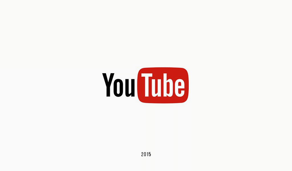
The YouTube logo in 2015
Like all previous redesigns, the 2015 version of the logo focused on changing the color of the logotype. The red became darker again, which gave the logo a more serious look. However, the rest of the logo has not been modified.
Source : turbologist
The YouTube logo in 2017
The 2017 version of the emblem is different from all previous logos. The red box has been moved to the right of the “YouTube” wordmark, while the word “Tube”, which was written in the box, has been replaced with a white play button.
The “YouTube” wordmark now appears in black with the Y and T in capital letters making it more dynamic. The current YouTube logo is energetic, contemporary, stylish and memorable.

Source : turbologist
The characteristics of the YouTube logo
The YouTube logo is characterized by several elements, namely:
The YouTube logo emblem
When a logo is tailored to a company’s target market, it becomes iconic. Not only does a relevant logo communicate the brand’s key personalities accurately, but it also informs the audience about what they can expect from the brand.
The red rectangular box with the white play button makes the YouTube logo unique and relevant.

Source : designbro
YouTube icons
The famous YouTube logo icon has undergone some changes over time. If the first versions included the name, since 2011, the icon has a play button.
In 2013, the proportions of the rectangle and triangle were changed. The shade of red initially used changed several times until the switch was remodeled to pure red in 2017.
Source : 1000logos
The font
At first, YouTube’s logo uses a distinctive and recognizable Helvetica font, which was widely used in television shows in the 1950s, making it look like “Tube” is part of “Youtube”.
Over time, developers have changed the font. The design team created a unique typeface, dubbed “Youtube Sans,” that draws inspiration from classic television and VHS styles. While giving it a modern look, they managed to preserve the history of the original typeface.
Colors
Youtube’s logo features three primary colors: white, black and red – a combination that creates an aesthetically pleasing image.
The colors highlight the traits and attributes that Youtube wants to show to the world:
- Optimism ;
- Excellence ;
- Purity;
- Passion ;
- Elegance;
- Perseverance.
It is largely thanks to this well-known color scheme that Youtube and its logo have reached such heights.
To tie the logo to the video, the designers opted for the shade of red (#FF0000) in the RGB color model. The white color is well aligned with the inverted triangle inside.
As for the color of the inscription, two options are possible: white (#FFFFFF) or black (#282828). The first variation is for a dark background, while the second is for a light background.
In summary
The YouTube logo has evolved over the years, but its meaning and symbolism have remained the same. Indeed, the YouTube logo is much more than a simple symbol. It represents the identity, values and vision of the platform.
The bold red color, minimalist design and custom font reflect the simplicity, passion and friendliness of the platform. It’s a logo that has stood the test of time and become ubiquitous in our online lives.
It symbolizes the originality and impact of the platform and its community. His impact on popular culture cannot be overstated, and his legacy will continue to shape the way we consume and share media for years to come.
Quite an exciting story, isn’t it? Well ! If you want a logo as captivating as YouTube’s, the Honadi agency brings together excellent designers who will have the pleasure of offering you a well-defined logo that corresponds to your values.