
When Microsoft revealed its first logo with a flying flag, people were surprised and intrigued.
Design agency Pentagram didn’t fail to ask the question during a meeting with Microsoft: “Why a flag? Your name is Windows!“
Microsoft explained that their brand began as a window, but evolved into a flag to reflect the growing power of computer systems.
However, the flag-flying logo didn’t last long. Microsoft quickly retraced its steps and came up with a new logo that truly reflects a window.
Why did they choose to make this complete change back to a logo that matches their name? This is a question that concerns us all.
But don’t worry, the story doesn’t end there! To discover the rest of the evolution of the Microsoft logo, follow us!
What you need to know about the Windows Logo
Microsoft developed Windows, a computer operating system that was first introduced in 1985 and is today used by millions of people around the world and available in more than 100 languages.
Obviously, on PC Windows comes in well ahead. With a good price/performance ratio, Microsoft’s operating system has established itself as the market benchmark.
Since 1985 until now, the Windows brand has presented more than 18 versions of its logo, ranging from XP to that of 98 and 2000.
Each version has its own distinctive logo. The latest one is Windows 11, which is one of the simplest brand logos since the inception of Windows.
The Windows logo was initially designed to be interpreted as a flag, but over time it became more concrete.
The meaning of the Windows logo
The Windows logo essentially featured a quadrant becoming the traditional and fundamental element of the logo. Additionally, the space created around the quadrant that forms a cross is a commonly used symbol in forming logo shapes.
Representing earth and space, the cross and the quadrant are logically interdependent. The Windows symbol usually has the colors red, green, blue, orange and white.
These colors reinforce the emblem’s association with the elements of earth, fire, water, flora and fauna. The name – “Windows” – refers to this versatility and multitasking capabilities.
Since the creation of the first logo until today, 15 distinct types have been created, all of which have one common feature: a stylized window linked to the product name. Microsoft is a name formed by the contraction of “microcomputer” and “software”.
Windows logo: From 1985 to 2021
Since its debut in 1985, Windows has undergone a transformation or, more accurately, a change that has propelled the technology forward.

Source : logo-marque
Microsoft Windows from 1985 to 2001
The first version of Windows featured a distinctive logo as its initial branding. It had four rectangles, like today, but back then they weren’t all the same, not even in shape.
The color was a very pale blue, and the name “Microsoft Windows” was written in serif to the right of the main emblem.

Source: logo-marque
Microsoft Windows from 1990 to 2001
In 1990, the emblem changed style. It depicts a monochrome arrangement with a window painting that features an extremely realistic white sheen. The name has been placed below the emblem with the same font, although the words are now of equal size.

Source: logo-marque
Microsoft Windows from 1992 to 2001
The period of use of the Windows “Flag” logo began in 1992 and continued until 2001. The first colored logo was created with a floating flag shape in pixels on the left side.
The right side of the logo consisted of four colored squares (red, green, blue and yellow) surrounded by a thick black border, while the wordmark appeared consistently in the lower part of the logo.
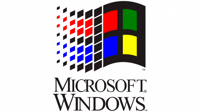
Source: logo-marque
Microsoft Windows from 1993 to 2001
In 1993, they used the same design as the previous version, with the “NT” lettering as the only change made.

Source: logo-marque
Microsoft Windows from 1994 to 2001
In 1994, the entire logo was redesigned, with an enlarged flag and the inscription “Windows” in enlarged form placed below the symbol, in a narrow, elongated font.
The “Microsoft” part of the logo, also in black serif type, was placed vertically to the left of “Windows”.

Source: logo-marque
Microsoft Windows from 1995 to 2001
Another redesign took place with the release of Windows 95. The small “Microsoft” part, done in a delicate sans serif font, was placed above the bold, large “Windows” inscription.
The colored square has been reduced and placed to the left of the inscription.

Source: logo-marque
Microsoft Windows from 1996 to 2004
In 1996, the company produced a new version of Windows NT. It then uses the same style as the previous logo. The only modification was the addition of the letters NT in bold in place of the number 95.

Source: logo-marque
Microsoft Windows from 1998 to 2006
In 1998, the brand used the same style again, and the only thing that changed was the “NT” replaced by the “98” executed in finer lines. All other elements of the design remain unchanged.

Source: logo-marque
Microsoft Windows from 2000 to 2006
In 2000, Windows ME and Windows 2000 were released as separate versions of the operating system. Their emblems have both been redesigned. For the new version of Windows ME, Microsoft used the previous concept.
They took two squares – red and blue -, overlapped them, and then covered the whole thing with a green-outlined square that had the usual Windows logo of the time inside (and was also slightly angled.) .

Source: logo-marque
Microsoft Windows from 2000 to 2010
For the 2000s logo, they simply took the emblem they had been using from the beginning, placed it on a white square and surrounded it with four other squares of different sizes, including three blue colored squares and a red square.
Below it are the words “Windows 2000”.

Source: logo-marque
Microsoft Windows from 2001 to 2014
In 2001, Windows XP was released and Microsoft finally decided to break tradition and design a new “window” for its operating system. It uses the same colors as the previous emblem, but without the black frame.
Additionally, the image has been distorted so that it appears as if the windows are flapping in the wind. Compared to previous designs, the text is no longer bold and is generally larger in proportion.

Source: logo-marque
Microsoft Windows from 2006 to 2017
In 2006, with the release of Windows Vista, the emblem was placed inside a dark blue circle. It was always rendered in a color gradient, although the texture of the squares was two-dimensional.
The logo was simplified and professionalized by eliminating the word “Microsoft”.

Source: logos-marques
Microsoft Windows from 2009 – 2020
With the launch of Windows 7 in 2009, the Windows logo became even simpler. The logo is now more substantial and the colors of the square have been intensified. The text settings are very similar to the 2016 variant.

Source: logo-marque
Microsoft Windows from 2012 to 2016
A new era of visual identity design began for Windows in 2012. The wavy emblem has disappeared: it is now just four azure squares whose perspective has been modified.
Immediately to the right, we find the word “Windows” as it appeared on the previous logo, but in blue, then the number “8”, also in light blue.

Source: logo-marque
Microsoft Windows 2013 – present
They pretty much used the same logo for Windows 8.1 released in 2013, except they changed the numbers for obvious reasons.

Source: logo-marque
Microsoft Windows 2015 – present
The Windows 10 logo hasn’t undergone any big changes either. The number at the end became “10” and the color became a little darker than usual.

Source: logo-marque
Microsoft Windows 2020 – present
In 2020, Windows 10X was released and Microsoft recycled the old logo once again. This time the text is slightly taller and darker.
As for the imagery on the left side, the color of the squares changed from darkest blue to lightest blue, clockwise from the bottom left.
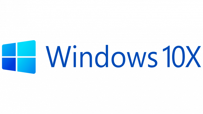
Source: logo-marque
Microsoft Windows of 2021 – present
Windows 11 is an interesting change. Microsoft decided to place the default icon panel in the center, which is also reflected in the logo.
It’s basically the Windows 10 logo, but with the new number 11, with no offset.

Source: logo-marque
The Windows logo symbol
It is also important to note that the emblem in question may change shades and colors depending on the design. It can be white if necessary, black if placed on a light background, or other colors.
However, these variations only apply to your PC icon or emblems used in certain promotional materials.

Source : logolook
Since Windows 8, the company has used wordmarks based on the Segoe font, although the style has been slightly changed.
To comply with the specifications of the New Metro design language, the current Windows logo features just one color: dark blue. You can find a free download of the Windows logo here.
In summary
Despite time, the Windows logo has evolved over the years while retaining its touch of originality and its imprint in its field of activity. This evolution can be understood thanks to a concise and thoughtful brand identity.
Today, the Microsoft Windows group is the leader as a quality operating system, and this through the trust acquired among users in the product, but especially in relation to the brand image. Learn through examples and detailed explanations on the subject here.