
With a 68% market share, Tesla is currently the most valuable automobile company in the world. It leads all traditional automakers in terms of innovation over the past ten years.
This meteoric growth is due to these ideologies, to the history hidden under the Tesla name and above all to its elegant and distinctive logo giving it this great notoriety. It can be found on a variety of media, from cars to solar panels.
So what would be the story behind this iconic logo? In order to better understand, we will examine through this article the origins, meaning and composition of the Tesla logo.

Source : dubizzle
History of the Tesla logo
The Tesla brand was born thanks to the ingenuity of the famous physicist Nikola Tesla. A man very famous for his discovery in 1882 of an alternating current motor and also for his extensive knowledge of engineering and technology. The use of his name contributed greatly to the brand’s popularity.
But on July 1, 2003, the company was founded by two investors, Martin Eberhard and Marc Tarpenning, to offer products based on Nikola Tesla’s discoveries.
A few months later, Musk joined Tesla and made the largest investment in the company’s history, $6.5 million. This allowed him to be appointed CEO, a position he holds until today and it was under his mandate that the company was able to flourish.
Tesla has had many moments of glory and pitfalls during its relatively short history.
It subsequently became a company that not only produces electric vehicles, but also infinitely scalable sustainable energy production and storage solutions. Tesla cars seem to come from the future.
The emblem clearly shows that the company is striving to use supernovae and even space technologies. Tesla brand cars are thus considerably improved, increasing top speed, braking and cornering.
Meaning of the Tesla logo
The Tesla logo is a distinctive, simple, elegant and futuristic logo, which plays an important role in making the brand memorable among its target audience.
Tesla expresses through its logo its vision of improving the transportation industry by reducing the carbon footprint through its electric vehicles and contributing to the green initiative. Looking at the contemporary Tesla logo, we can deduce that it is associated with technology.
The Tesla logo is the perfect illustration of a cross section of an electric motor. The Tesla logo is a distinctive and futuristic representation of the letter “T”. This is a logo that adopts the colors white, black or red.
The central segment of the letter “T” of the logo symbolizes a pole extending from the rotor of a motor, while the additional line above it represents a stator component.
By repeating the Tesla logo in a circle, with the top of each “T” facing outward, we get a good approximation of the cross section of an electric motor.
Chronology of the different Tesla logos
Source : logos-world
RO Studio, the American design agency that also created the logo for Elon Musk’s second company, SpaceX, conceptualized the Tesla logo in 2003.
The primary function of the Tesla logo is to clearly communicate its electrical origins. Formally, the logo is just the capital letter of the brand name. However, it also represents an element of the electric motor.
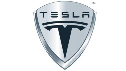
The first version of the Tesla emblem was shaped like a shield, which explains the unique configuration of the capitalized letter “T” inside the emblem.
Source : 1000logos
While the most common interpretation of the Tesla logo, besides the stylized letter “T”, is that it represents a shield, a symbol of safety, there are other fascinating theories about the meaning of this ubiquitous emblem.
As we know, Tesla goes to great lengths to ensure that every facet of the driving experience contributes to driver satisfaction and safety.
But, like most mysteries, Tesla’s is based on a fairly simple central idea.
Asked on Twitter, Elon Musk explained that the Tesla emblem is similar to the SpaceX logo, the letter “T” resembling a cutaway view of an electric motor and the “X” representing the trajectory of a rocket .
The Tesla logo embodies the essence of the company, its achievements and its innovative approach to automotive design, with a modern and futuristic aesthetic.

Source : 1000logos
The logo has remained unchanged since its creation and is incorporated in different colors depending on the media. Get the PNG version in download here.
Tesla logo design

Source : highway
Originally, the Tesla logo was designed to fit into a given geometric figure, but the company eventually gave up and chose to use the “T” as its trademark.
Just like the brand itself, the Tesla logo is known to everyone. It is unique, futuristic and memorable.
Although the car company is only 18 years old and there are only a handful of Tesla cars on the roads, its logo is easily identifiable around the world. This is the power of a good logo.
The black Tesla emblem stands out against a white background. It looks luxurious and powerful – the black and white color scheme helps to give an image of luxury and high quality.
The first authorized version of the emblem featured a stylized T-shaped element in the center, with the brand name located directly below. Since then, the design has never changed.
Conclusion
Ultimately, we can remember that the Tesla name was a determining element in the company’s growth, but above all the Tesla logo was able to reveal the company’s ambitions through its distinct meaning and simplicity.
Discover more stories about logos of major brands through this blog and how have they maintained their popularity despite the changes?