
Have you ever seen a car with a lion on the hood? If so, then you have probably seen a Peugeot car!
Founded in 1810, Peugeot is a French automobile company. Yes, you read that right – Peugeot is a company that is over two centuries old!
Obviously you can’t wait to hear the fascinating story of the oldest automobile brand in the world.
I will tell you about it through this article as well as explain the meaning of the different versions of the logo that have existed over the years.
The history of the Peugeot logo
Peugeot is a French automobile company founded 213 years ago. For drivers around the world, it is a symbol of quality.
Over the years, the brand logo has undergone several changes, but it has always remained true to the brand’s core identity.
The history of Peugeot dates back to the end of the 18th century, when the Peugeot family began producing coffee grinders and cutting tools. In 1810, the company began producing bicycles, then steam-powered cars, and finally, gasoline-powered cars.
Over the years, the Peugeot brand has become a symbol of reliability, design and technology.
The first Peugeot logo was created in 1847 and it depicted a lion standing on its hind legs. This lion was a tribute to the town of Belfort, where the Peugeots had purchased a factory which produced cannons for the French army.
The Belfort lion was a symbol of resistance and strength, and Peugeot decided to use it as a symbol of its brand.
Since its creation, the logo has undergone few, if any, changes. In 1850 the lion was turned to the left, in 1875 it was simplified and in 1948 it was stylized to resemble a contemporary lion. However, the logo was first redesigned in 1960.
The meaning of the Peugeot logo
It is clear that the lion has always been an important symbol for the company, representing strength, power and speed. But the logo has also evolved over the years to reflect the company’s changing values and priorities.
Each new change to the logo represented a different era in the company’s history. The first Peugeot logo featured a lion in its center, a nod to the family coat of arms.
The Peugeot family, which founded the company in 1810, had a long tradition of breeding lions, and the lion became a symbol of strength and power for the family.
Historical roots, great prestige, limitless power, that’s what Peugeot wants to show. Its range of cars is adorned with a logo that perfectly meets these criteria since it represents the king of animals, the lion.
Moreover, it is not easy, but it is heraldic. It is represented from different angles: on four or two legs, sitting on a rock or walking.
There is also a variation with a maned head without a body. The styles in which the designers worked are also different and reflect the realism of the empire.
The different Peugeot logos from 1947 to today
The Peugeot logo has undergone many changes throughout its history. But the lion has always been present as a symbol.
The Peugeot logo from 1810 – 1858

Source : logos-world
The brand’s first logo is represented by the lion walking on an arrow. At that time, it was said that the lion’s sharp teeth represented the strength of the company’s steel products and the sustainability of the company.
The Peugeot logo from 1858 – 1889

Source : logos-world
The lion of the emblem became darker and brighter between 1858 and 1889. As for the outlines and the concept, they remained the same, there was only a question of darkness in this redesign. No lettering appeared either.
It is important to specify that it was at this time that the Peugeot family officially registered the lion brand, which represents the speed and strength of its bicycles and motorcycles.
The Peugeot logo from 1889 – 1910

Source : logos-world
During this period between 1889 and 1910, the company introduced its first car and restructured its emblem. The designers modified the lion: they eliminated the fierce expression and muscular appearance, improved the realism of the features, lengthened the tail and painted the tip of the arrow black.
The Peugeot logo from 1910 – 1925

Source : logos-world
In 1910, the logo was made into a 3D figurine with a remarkable design. The creature acquired a bulky appearance due to the effective distribution of shadows and lights on its body.
The animal looks to the right, growls threateningly, pulls out the claws of its left front paw and presses the arrow on the stone with its right paw
The Peugeot logo from 1925 – 1936

Source : logos-world
At the time from 1925 to 1936, the company used the previous version of the logo, but without the three-dimensional aspect. The replacement version of the logo from this era is flattened to simplify printing. It consists of a circle colored red and a black rectangle which contains the name of the brand.
The term “Peugeot” is written in capital letters, in a rigid and angular style. The letters are prominent and imposing, like a lion. The hollows “U” and “G” resemble the open mouth of a predator.
The Peugeot logo from 1927 – 1936

Source : logos-world
During this period, the logo used was broadly similar to those of the previous one. The lion is represented in a general way, without small artistic nuances.
The king of beasts is massive, formidable and impressive. He stands on a rock, his left paw raised. Under his right paw is an arrow.
The designers turned the red disk into a shield with a gold border, and the name of the automobile company was placed in a black trapezoid with a figured cutout at the edges.
The Peugeot logo from 1936 – 1948

Source : logos-world
The period between 1936 to 1948 marks the legendary beginning of Peugeot’s colorful emblems. The lion, which without recall is the representation of the previous logos, is again represented turned to the left and perched on a slender spire.
The creature’s tail is borrowed from the 1889 emblem; the other elements are an amalgamation of the initial brand names. The only contrast is the traditional shield with a dark border and bands at the base.
The backdrop is colored yellow, while the creature’s features, lion, and surrounding details are shaded dark blue.
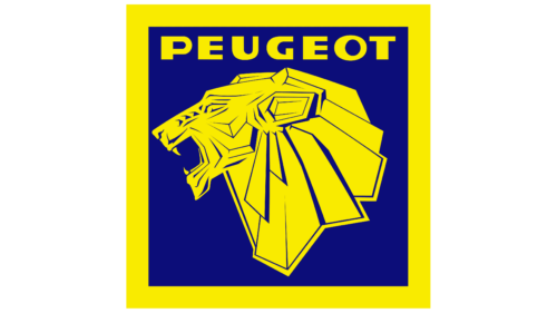
The Peugeot logo from 1948 – 1950

Source : 1000logos
Designers placed the creature on its hind legs for the logo adopted in 1950. The lion in the foreground lunges forward and extends its claws. Its mouth is open and a long tongue protrudes.
In the background, a heraldic emblem (probably a vertical banner) is visible, with a black background and gray markings.
The Peugeot logo from 1950 – 1955

Source : logos-world
After a design overhaul, the Peugeot logo from 1955 has become much more colorful and interesting: it has color and internal dynamics. This was created thanks to the fine contours with which the figure is drawn.
At the same time, the black lines contrast effectively and perfectly set off the yellow color of the lion.
The Peugeot logo from 1955 – 1960

Source : logos-world
At the same time, another version was used, taking the form of a triangular shield with painted edges. With its thin paws and extended claws, the lion in this version is more elegant and less bulky.
The tail, as before, is figuratively raised and curved, resembling a flower with a bud. Above the creature, the term “Peugeot” is written, with an abbreviated variation of the letter “E”.
The Peugeot logo from 1960 – 1968

Source : logos-world
The designers focused on the lion’s head to better emphasize its power, strength and endurance. To do this, they drew the animal in profile. This angle allows you to better convey your emotions.
A wide open mouth, gripping fangs, a frown, a large ear, a chic mane on a large neck convey the equanimity, confidence, brutality and charisma of the animal.
In addition, the hanging strands are placed at an angle for a harmonious combination with a shield surrounded by a gray band. At the top is the brand name in a classic design.
The Peugeot logo from 1968 – 1970
Source : logos-world
In 1968, the company radically transformed the style of its logo, which was now characterized by bold strokes, precise contours and sharp angles.
The lion resembles an Egyptian deity, with rectangular ears and a trapezoidal mane, and the triangular background has been replaced by a square background. The predator growls and shows fearsome fangs.
The Peugeot logo from 1970 – 1975

Source : logos-world
In the period between 1970 and 1975, the logo presented was cute and sweet. The name of the car manufacturer suffered the same fate: it received a rounded typeface with lowercase letters as if they had been written by hand. Only the corners of the shield remained sharp.
The Peugeot logo from 1975 – 1980

Source : logos-world
Once again, the logo underwent significant changes, this time reversing the proportions of the lion and lettering.
A small lion standing on its hind legs now occupies the upper part, while the massive term “Peugeot” is located at the bottom. The monochrome palette has been retained.
The Peugeot logo from 1980 – 1998

Source : logos-world
Between 1980 and 1998, the lion of the emblem took the contours of the previous logo, and also received a white outline and a blue background. The name of the company is written below the square. It is written in block letters and in reduced size, so that the eye focuses first on the royal animal, then on the text.
The Peugeot logo from 1998 – 2002

Source : logos-world
Towards the end of the 20th century, the emblem that just appeared served as inspiration for designers. However, this time they amplified the size of the lion, balancing with the legend at the base, in order to create a harmonious appearance between the predator and the text. Additionally, a blue square appeared to replace the background.
The Peugeot logo from 2002 – 2010
Source : logos-world
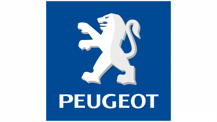
In 2010, the designers decided to merge the lion and the brand name by positioning them in the same square. The right side of the creature is somewhat shaded.
The Peugeot logo from 2010 – 2021

Source : logos-world
Today, the emblem used is well stylized in the form of a metal figurine. Although the lion’s posture remains unchanged, it now has anthropomorphic qualities. Its color is bright, a mixture of white, gray and blue.
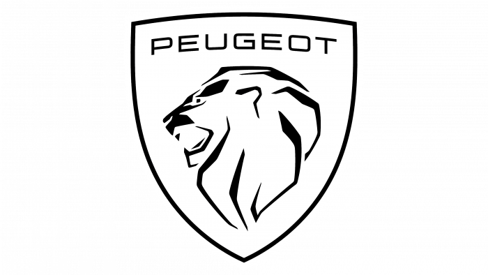
The Peugeot 2021 logo

Source : logos-world
The current Peugeot logo has been implemented since 2018. The project designers had the idea of modifying the Peugeot e-Legend emblem from the 1960s in order to obtain a more refined and modern design.
The resulting appearance of the new emblem does not differ significantly from the previous version, with the exception of the font used to write the word “Peugeot” positioned above the lion’s head.
Font and colors
Source : logos-world
In 1998, the logo featured the Castle T Bold typeface created by Steve Jackaman and published by the URW Type Foundry.
Source : logos-world
Throughout its history, the Peugeot logo has maintained a sober color palette, composed of black and white.
When colors have been used, they have been in limited quantities, for example combining yellow and blue or white and blue. Additionally, various shades of gray were used, ranging from graphite to metallic silver.
In summary
All in all, the Peugeot logo has undergone several evolutions over the years, but one thing remains constant: its importance and its meaning for the brand.
From the beginnings of the lion symbol to more modern and refined designs, the Peugeot logo has represented the brand’s values of quality, innovation and performance.
As we have seen, the Peugeot logo has played a crucial role in developing the brand’s identity and building customer loyalty.
If you would like to learn more about brand identity and logo design, do not hesitate to consult the section of this blog dedicated to graphic design to discover other examples and other points of view.
By understanding the meaning of logos such as Peugeot’s, you will be able to better understand how brands use visual cues to communicate their values and connect with their audience.