
Facebook is the world’s largest social media platform, with over 2.9 billion active users per month. The platform has been around since 2004 and has seen many changes and updates throughout its history.
Despite its growth and the company’s few changes, one aspect of the platform has remained relatively constant: it is indeed its logo. But why does the world’s most popular social network have such a basic logo? Or were there several?
In this blog post, we’ll learn a little more about the history, meaning, and different versions of the Facebook logo.
History of the Facebook logo
Facebook’s original logo was revealed in 2004 when the platform launched, featuring the lowercase word “Thefacebook” on a blue background.
Mark Zuckerberg and co-founders Eduardo Saverin, Andrew McCollum, Dustin Moskovitz and Chris Hughes created this logo.
The following year, the company dropped the word “The” from its name and updated the logo to feature the word “Facebook” in lowercase on a blue background, using a custom typeface called Facebook Letter Faces.
In 2015, the logo was updated again with a more modern font and a slightly lighter blue background, in order to convey a friendlier and more accessible image.
It was finally in 2019 that the current Facebook logo was introduced, with a simplified design consisting only of blue Facebook writing on a white background.
Signification du logo Facebook
Facebook’s logo features the word “Facebook” in small blue letters, a color often associated with trust and stability.
Many companies that want to be seen as reliable and secure use the color blue.
The use of lowercase letters in the font is also significant, as lowercase letters are generally considered more accessible and user-friendly than uppercase letters.
This approach is consistent with Facebook’s overall branding, which focuses on the idea of connecting people and building communities.
The Facebook Logo Timeline
The name Facebook is a name that every young person in the world today knows. The project was initially based on the accessibility of a simple online photo directory, it subsequently transformed into a social network service appreciated by more than 3 billion people around the world.

Source : 1000logos
The Facebook logo in 2003

Source : 1000logos
At the very beginning, the project was only a prototype and was called Facemash. A name which was chosen from a red initial as the first logo. The font used was white capital letters placed on a brown background.
The Facebook logo in 2004
Source : 1000logos
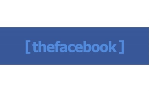
In 2004, the year of the birth of the real Facebook project, the successor to Facemash, the brand new website created in the spotlight, had a not too conventional logo composed of “thefacebook” in light blue on a dark blue background, with the name in square brackets.
The Facebook logo in 2005

Source : 1000logos
A year later, Facebook decided to change its logo. The previous Facebook logo has therefore undergone some modifications, such as:
- The removal of the article “the” and the brackets;
- Replacing the blue lettering with white lettering.
The Facebook logo in 2015

Source : 1000logos
In 2015, the typeface previously used in 2005 underwent some minor alterations. The most visible change being the redrawn “a”, while other letters have also undergone subtle changes.
The Facebook logo in 2019

On Tuesday, April 30, 2019, Facebook introduced a new logo that features the Facebook name in blue-colored lettering on a white background.
The full company name logo will no longer be used only for the company itself, but also for all its services.
Facebook logo favicons

Source : 1000logos
The Facebook icon has undergone several changes, but most people haven’t noticed them unless they pay attention. Each modification made the symbol more minimalist.
The first icon was the most complex: a light blue frame with the letter “f” in lowercase and a “wave” background. From 2009 to 2013, a faint blue line was added to the bottom of the letter “f”, then moved to coincide with the edge of the box.
The line was removed and the letter “f” was moved closer to the bottom of the box in the 2013 version. The only “extra” element is a barely visible 3D effect.
In 2019, the new one featured the letter “f” in a circle rather than the previous rounded square container. The “f” is now positioned in the center of the icon, and no longer on the right side.
Facebook logo design
The original Facebook logo featured the company name in light blue, with brackets added to the letters to create the illusion of a box, against the familiar background we know today.
When the decision was made to remove the word “The” from the name, the logo was modified by changing the text color to white for better contrast.
The new typeface used in the logo is a custom version of Klavika, the design of which was entrusted to the Cuban Council agency, based in San Francisco.
The company, like many other technology companies, chose a sans serif font to ensure optimal readability on the web.
The logo has remained virtually unchanged since then and can be easily adapted for different uses, as seen in the company icon above, which only features the first letter of the company name.
In summary
The Facebook logo has played an important role in the growth of the social media platform.
Although it has undergone several changes over the years, the logo has managed to maintain its simplicity and impact, making it instantly recognizable around the world.
The story of the Facebook logo reminds us of the power of branding and the importance of creating a visual identity that represents your brand’s values and goals.
If you would like to know more about visual identity major brands, do not hesitate to consult the section of this blog dedicated to graphic design.
There you’ll find a wealth of information and resources that will help you better understand how businesses use design to create a unique brand identity.